Watching systems: views, the Sampler, statistics and each model's observables
Every running system is measured continuously and drawn several ways. The first sections cover what is common to all models, namely the views, the Statistics window, the Sampler and the machine-learning layer. The per-model sections that follow detail each model's own views, display options and observables.
Views
The header’s View selector lists what the current model and mode provide. Two floating windows sit beside it. View Settings, the eye icon, holds a view’s display options, which are colours, trails, glow and phase axes. Interaction & Paint, the brush icon, holds its tools, which are the paint brushes and, in the phase view, the Pan/Zoom tool. Both are detailed per model below.
| View | Contents |
|---|---|
| Lattice | The grid itself, for single-system lattice models. Trails, per-type opacity and painting belong to the Multi-Component Lattice view, described under Multi-Component Lattice. The 2D Ising Lattice view offers spin colours and grid lines only, and cannot be painted. |
| Particles | Patchy Discs & Polymers’ periodic box, showing every disc, patch, bond and polymer backbone. See Patchy Discs. |
| Observables | A live time-series plot of any observable, in single-system mode, by class, with one line per type or species. See Multi-Component Lattice. |
| Ensemble | The phase-space cloud, with every replica plotted at two observables. Where provable, amber dashed curves mark theoretical envelopes and the forbidden region is shaded. Glow and history smearing are adjustable. |
| Graph | The cluster graph, organising the ensemble by similarity rather than by coordinates. |
| Split | Two of the above side by side. See Split view. |
The Lattice, Particles, Ensemble and Graph views are rendered on the GPU, and the Observables time-series plot on the 2D canvas.
Axis choice is model-specific. The Multi-Component Lattice and Patchy Discs offer axis pickers in View Settings, each axis selected as an observable class and then a Global or per-type variant, with colour swatches matching the statistics chips. 2D Ising is fixed at mean site magnetisation against same-type bond excess, and the Single Particle at position against momentum.
The Colour by control sets how the phase-space sprites are tinted. The Multi-Component Lattice offers Uniform and Dominant type, 2D Ising offers Uniform, Magnetization, Current Energy and Per Brush Stroke, the Single Particle adds Initial Energy and Localized Well, and Patchy Discs offers Uniform alone, its per-species colours belonging to the Particles view. A Density Blend selector chooses how overlapping sprites accumulate, either Soft Add or the brighter Full Add.
Framing the phase view
Every Ensemble view offers two ways to frame the cloud. Smart zoom, on by default and switched in View Settings, opens the view zoomed onto the region the systems occupy rather than showing the whole axis range, and re-frames as the cloud spreads. It has a built-in zoom limit, so a cloud collapsed onto a single point, as at the very start of a run, is centred and bounded rather than magnified without limit. Switching it off freezes the camera where it is, and a double-click returns to the full phase space with its theoretical envelopes. Smart zoom is offered for the Multi-Component Lattice, 2D Ising and Patchy Discs. The Single Particle has its own camera instead, presented as a Camera group with an Auto / Manual selector and a Zoom slider.
For manual control the Pan/Zoom tool, which is the default interaction mode in all four models, pans on drag and zooms at the cursor on scroll, and a double-click resets to the automatic fit. A stationary click still samples the nearest system into the Sampler, exactly as in Paint mode, so systems can be inspected without leaving Pan/Zoom. Panning or zooming by hand suspends smart zoom until a reset. To paint systems in phase space the tool must be switched to Paint in Interaction & Paint. Painting works for the Multi-Component Lattice, 2D Ising and the Single Particle. For Patchy Discs the phase brush is deliberately inactive, since a random re-seed cannot target a bonding observable, and clicks there still select.
Split view
Split shows two views at once. Neither is simplified. Each half is the full view drawn at half width, keeping its own axes, legend, camera, rendering and cursor. Which two depends on the mode.
- Ensemble, for all four models. The Ensemble phase-space cloud beside the cluster graph. The cloud shows where the population sits in observable space and the graph shows the states the learning layer has extracted from it, so a region of the cloud and the node it belongs to are visible together.
- Single system, for the Multi-Component Lattice and Patchy Discs. The Observables plot beside the system itself, either the lattice or the box of discs, so a curve and the configuration producing it can be read at the same moment.
Both halves are configured from the one View Settings window, which divides into two collapsible sections named after the panes.
The divider is draggable. A grip sits at the middle of the seam. Hovering anywhere along the seam brightens it and changes the cursor, and dragging gives one view more room. Neither half can be reduced below a third of the width, so the range runs from one-third and two-thirds to two-thirds and one-third. Each half re-fits as it resizes. Axes rescale, the lattice or disc box re-centres, and the phase view’s history trail is carried across rather than redrawn. The position is a proportion rather than a pixel column, so it survives collapsing the control panel and resizing the window. Start Fresh returns it to even halves.
Each half keeps its own interactions, which apply wherever the pointer is. In single mode painting is confined to the system half, so dragging over the plot does nothing. In an ensemble, Pan/Zoom, scroll-to-zoom, double-click-to-reset and painting all act on the phase-space half, while clicking a node in the graph half selects that node. Either click feeds the same Sampler, and selecting in one half clears the other, so the Sampler always describes exactly one system. The Single Particle has no per-system preview, so neither half samples there.
Observables & statistics
Stochasm measures a feature vector for every system on the cadence set by the Measurement rate slider, up to once per frame. These are the same numbers that drive the phase-space axes, the plots and the machine-learning layer. What is measured is model-specific, and is detailed in the per-model sections below. How it is read is common.
The Statistics window
The header’s bars icon opens a floating window reporting the system’s measurements live. For the Multi-Component Lattice and Patchy Discs it lists every currently enabled observable. In single-system mode it describes the system, and in an ensemble it sits inside the Sampler and describes the selected system. 2D Ising and the Single Particle instead show a fixed set with a sparkline and bars. Ising reports ⟨m⟩, ⟨|m|⟩, ⟨e⟩ per site and the Onsager critical temperature, and the Single Particle reports ⟨H⟩/N with kinetic and potential bars. In ensemble mode both report population means rather than a selected system.
The heavier observables can be switched off to save their computational cost. The Compute tab’s Observables card toggles the optional groups during a run, and a disabled group’s observables disappear everywhere, from axes, plots, statistics and learning.
The Sampler
An ensemble shows many thousands of systems at once. The Sampler isolates one of them. Clicking any point in the Ensemble view, or any node in the Graph view, opens it. It has three sections, a Mode selector, a System View showing the system’s state with its index, and its full Statistics.
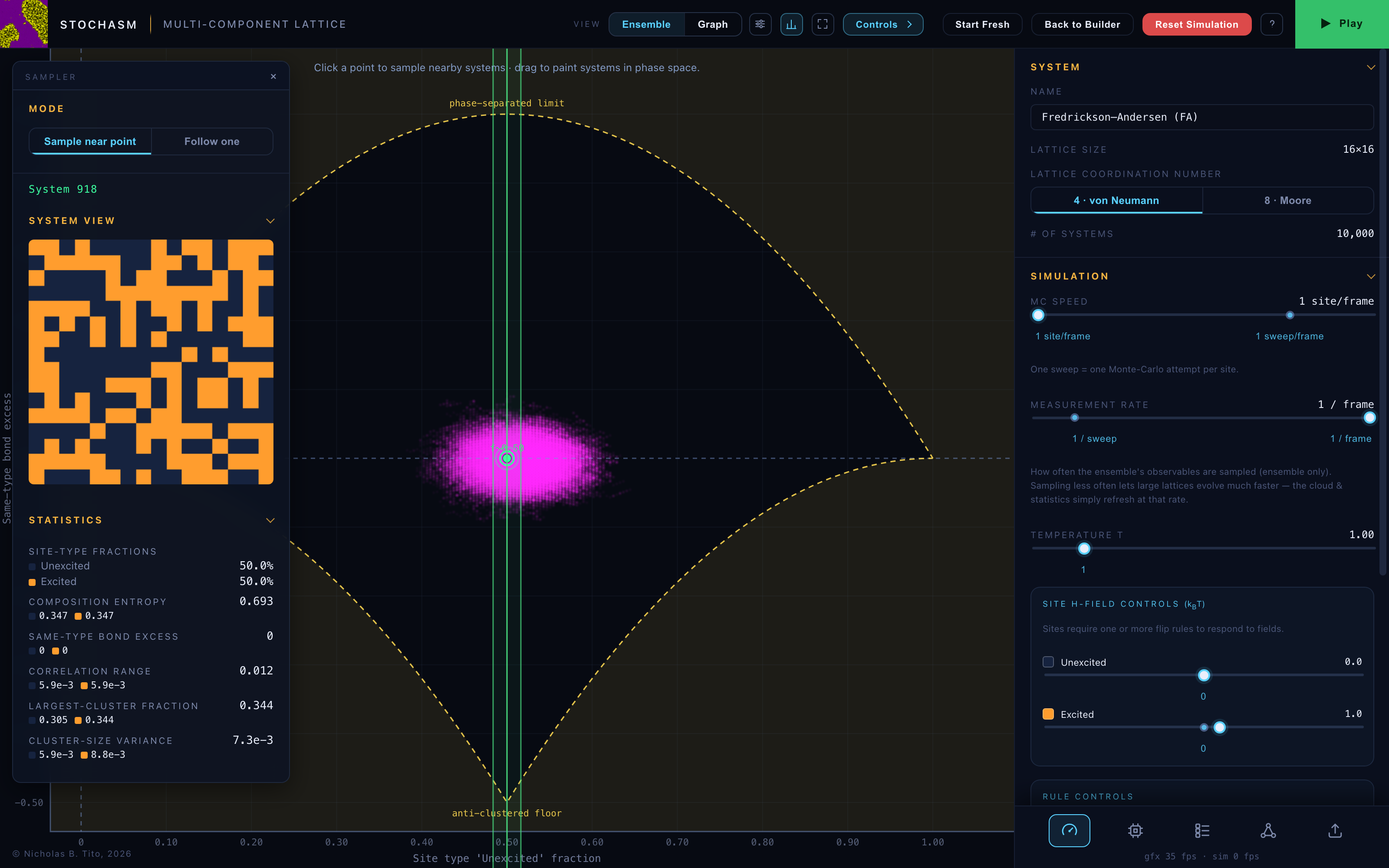
The Mode selector chooses how the preview behaves.
- Sample near point, the default. The Sampler cycles through systems near the click, a fresh one roughly every third of a second, each shown as a frozen snapshot. The green rings mark the sampled point and the green dot shows where the current sample sits.
- Follow one. A single system is held and watched live, its green dot moving with it through the cloud.
The selected system is exempt from the phase brush, so the surrounding region can be painted without losing it. The cross, a click on empty space, or Reset Simulation clears the selection. The neon green ring and sprite always denote the selected system, and no other element uses that colour.
Machine Learning
The Machine Learning tab hosts the learning layer, which works for any model’s ensemble. Its first instrument is the cluster graph. Every system’s observables form a feature vector, the features are standardised, and the ensemble is clustered. One node is drawn per learned cluster, sized by population, and one edge per observed transition between nodes, weighted by how often tracked systems make it. Nodes are then grouped into communities, and it is the communities that the colour-coding shows. The palette deliberately avoids the selection green. Once started, learning proceeds in any view, sampling and re-clustering in step with the measurement cadence, so a low measurement rate gives slower but never stale learning, and the green follow-tracer moves between nodes at that cadence rather than jumping.
The learning is independent of the simulation. Play runs the physics, and the cluster graph learns only while instructed to, from the Run card in the Machine Learning tab. Start machine learning begins, Pause freezes it, and Continue resumes from where it stopped. The simulation proceeds regardless. Because learning consumes measurements it requires the simulation to be running. Until Play is pressed the card says so, and pausing the simulation suspends learning until it resumes, at which point learning continues from where it was.
With the simulation stopped the Graph view shows only the instruction to start the simulation first. Once the simulation is running, and before learning has been started, it offers a button opening the Machine Learning controls directly. At the foot of the Run card, live readouts report the node count, the reservoir state and the samples per node. Reset learning in the same card clears what has been learned, and is enabled whenever learning is not actively progressing, so learning or the simulation must be paused first. Resetting the simulation from the header clears the learning as well, since a re-seeded ensemble is no longer described by the learned graph.
The tab opens in Basic, offering two controls. Detail is the axis from fast and coarse to demanding and fine. It moves the node count, the reservoir size and the number of tracked systems together, so the statistical ratios that make the graph trustworthy are held fixed and only the resolution changes. Its Balanced snap sits where there are as many nodes as systems per node, which is the launch default. History is the orthogonal axis, setting how far back the graph remembers, from a short window in which stale transitions fade to the whole run, in which everything accumulates. Its readout is in simulation time, in sweeps or τs, rather than wall-clock time.
Advanced exposes the parameters those two controls drive, namely Granularity in nodes, Systems tracked as a share of the ensemble assigned to nodes at each measurement, which sets how precisely populations are known, Sampling Rate, Re-learn every in samples, and the reservoir’s Size and Memory. The two views are linked in both directions. Moving a Basic control updates the Advanced values, and editing an Advanced value re-derives the Basic controls.
Detail’s range is set by what the data can support rather than by machine speed. One ceiling is population resolvability, at no finer than about 25 systems per node, below which node sizes are noise, and it moves with the ensemble size. The other is centroid identifiability, requiring enough reservoir samples per node relative to the number of observables, and it moves with the observable count, so switching groups off in the Compute tab therefore yields more usable nodes. Whichever ceiling is lower applies.
Because sampling happens only when observables update, measuring often while simulating slowly yields many near-identical samples. What matters is therefore coverage per unit of simulation progress, which is one Monte-Carlo sweep for the lattice models and τs for Patchy Discs, the average single-particle relaxation time. It is the time a disc takes to diffuse its own diameter and so leave its cage. For this Langevin engine τs = σ²γ⁄4T, which is why it shifts with temperature and friction. The Single Particle defines no such unit.
Sampling Rate is therefore scaled in those terms. It runs up to 200% per sweep or τs, or 100% of the ensemble per measurement, whichever is lower. 100%, covering the ensemble once per unit of progress, sits at the midpoint for models with a progress unit, is marked with a snap and is the launch default. The Single Particle launches at 5% per measurement instead. From there the rate follows the simulation. Changing the measurement rate, the MC or MD speed, or for Patchy Discs the temperature or friction, rescales it so the chosen coverage is preserved. The handle stays where it is and only the per-measurement percentage changes.
Clicking a node opens a member system in the Sampler, and repeated clicks cycle through distinct members. A node whose members have all moved elsewhere falls back to a stored specimen, titled Stored sample. The Graph view’s own View Settings section offers Node Colouration, either By feature or By kinetics, an Edge brightness slider, a Tracers sub-card controlling the flow tracers in visibility, brightness, speed, colour scheme and number, a Select Feature for Graph Rendering dropdown, and Feature Details and Community Details panels.
Switching observable groups off changes the feature space, and the graph re-learns accordingly. Further learning algorithms are intended for this tab.
Multi-Component Lattice
Observables
The lattice model’s observables fall into seven classes, each with a Global system-wide value and, where meaningful, one value per site type.
| Class | Quantity |
|---|---|
| Site-type fractions | The composition, each type’s share of the lattice. |
| Composition entropy | Shannon entropy of the composition, in nats. It is 0 when one type dominates and ln N when equimolar. |
| Same-type bond excess | The extent to which neighbouring same-type pairs exceed the random-mixing baseline. Positive indicates clustering and negative anti-clustering, as in stripes or a checkerboard. |
| Correlation range | An integrated pair-correlation excess, a proxy for domain size. |
| Largest-cluster fraction | The largest connected same-type cluster as a fraction of the lattice, the percolation order parameter. |
| Mean cluster-size fraction | The mean cluster size as a fraction of the lattice. It rises as domains coarsen, so a lattice broken into many small clusters scores near zero and one separated into a few large ones scores high. |
| Cluster-size variance | The dispersion of the cluster sizes. |
The last four classes require union-find and correlation scans, so the Compute tab’s Observables card allows the Pair correlation function group, holding Correlation range, and the Union-Find (clusters) group, holding the three cluster classes, to be switched off, which removes them and their cost from axes, plots, statistics and learning. The card’s matrix shows which variants, global or per type, each observable provides.
The Observables view
The Observables view plots any class as a live time series. The class is selected from a dropdown, each global and per-type series has its own toggle and swatch, a slider sets the scrolling time window, and dashed cumulative time-average curves can be overlaid.
The dashed curves answer a different question from the solid ones. At every instant a dashed curve shows that observable’s average up to that point, which suppresses the noise and indicates where a quantity is settling rather than where it currently is. Time average (dashed) selects which average. Full run is the mean of everything since launch, which converges and then changes little, and is the appropriate reading for an equilibrium value. Time window is the trailing mean over the window set above, which tracks a system that is still changing and re-shapes as that slider moves. Reset running averages restarts the Full-run accumulation from the present moment, which is what is wanted after changing a parameter mid-run, since the previous mean described the previous system. History already recorded keeps its original averages, which were correct when measured. A Grid lines toggle draws gridlines inside the plot.
Phase & lattice display
In the Ensemble view the axis pickers place any two observables on the plane. When one axis is a site-type fraction and the other is same-type bond excess, amber dashed curves draw the provable envelopes, a phase-separated ceiling and an anti-clustered floor, with the forbidden region shaded. The envelopes track the lattice coordination number, the floor lying at −1/4 for the 8-neighbour Moore shell and −1/2 for the 4-neighbour von Neumann shell.
On the single-system Lattice view each type also has display-only Blur and Alpha controls, together with a Grid lines toggle. Blur gives moving sites a fading trail, on a logarithmic scale whose upper region holds most of the travel, and at maximum the display becomes an occupancy heat map. Alpha sets the type’s opacity. Neither affects the physics. The trail advances only as the simulation does, so pausing freezes it, and painting never advances it. Painted sites recolour immediately, and the rest of the trail changes only with the simulation’s own motion.
2D Ising
The Ising ensemble is plotted as a cloud of mean site magnetisation against same-type bond excess, on fixed axes. Below the critical temperature the cloud moves toward the ordered corners, and above it pools near zero magnetisation. Amber dashed curves mark the theoretical phase-separated and Néel envelopes, with the forbidden region shaded, so the population can be watched pressing against the bounds statistical mechanics allows.
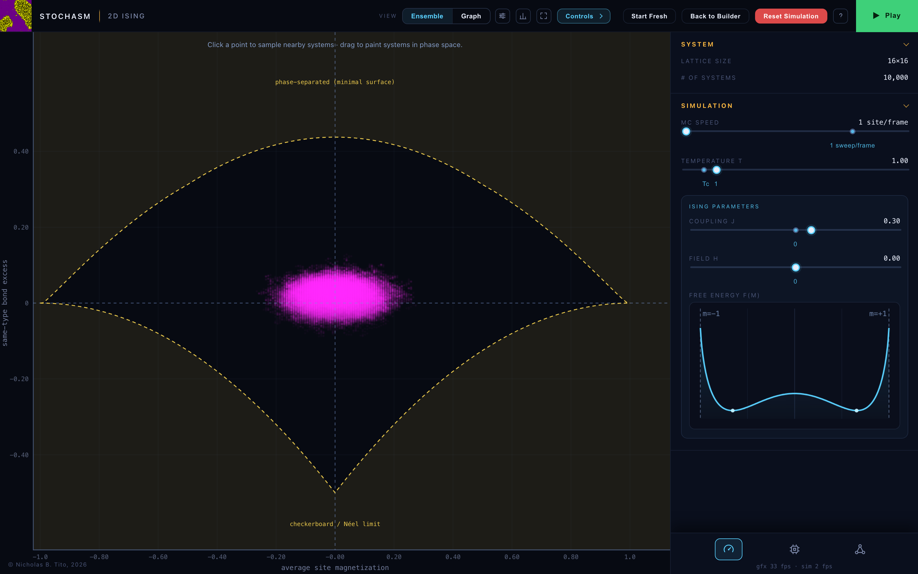
The single-system Lattice view offers Spin colours, one picker each for up and down, and a Grid lines toggle. It cannot be painted.
Single Particle
The single particle’s view is the ensemble phase space over position and momentum. Thousands of walkers, released and thermalised, settle into a Boltzmann cloud whose shape is the equilibrium distribution of the chosen potential, a single Gaussian in a harmonic trap and a two-lobed cloud in a double well. Glow and history smearing trace the flow as walkers cross between wells.
Patchy Discs & Polymers
The Particles view
The Particles view draws the periodic box live, and the View Settings window controls how. Disc opacity and Patch opacity set per-species and per-patch-type alpha, with outlines fading alongside their fill. Periodic images toggles the wrapped copies at the box edges. Bound patches chooses how bonds are drawn, as a dot between the bonded patches, as the patches themselves in the highlight colour, both, or neither, and the Show bonds for matrix restricts the rendering to selected patch-type pairs. Binding renders are always drawn at full opacity, so reducing every other opacity leaves the bond network alone visible. Highlight bonded discs fills any disc with at least one bond in the highlight colour, and Bond trail leaves fading after-images of the binding renders. The Bond highlight colour picker sets the single colour every binding render uses, in the dots, the patches, the filled discs, the trail and the Sampler’s bond strokes.
Observables
Every patchy observable is measured per species as well as globally. Energy is attributed half per endpoint, alongside bonded slots, first-shell contacts and same-species bond clusters. The Statistics listing shows each class as a header row carrying the global value with per-species chips beneath it, in single-system mode and in the ensemble Sampler alike, and the per-species variants are available wherever the global ones are, on phase axes, in the Observables plot and in the learning layer.
The base observables, always enabled, are Energy / disc, Patch bond fraction and Patch bonds / disc. A polymer design adds ⟨Rg⟩ and ⟨Re⟩, and NPT adds packing fraction φ. Each system being an independent box of the designed molecules, the cloud traces the self-assembly as bonds knit the discs into chains, networks or micelles.
The Contacts (first shell) group measures positional rather than bonded neighbours, and is the disc analogue of the lattice’s same-type bond excess. It reports Contacts / disc, the number of discs in a disc’s first coordination shell, Same-type contacts / disc, how many of those are the same species, and Same-type contact excess, the same-type contact fraction minus the random-mixing baseline, which is zero for a random mixture, positive when like discs cluster and negative when they alternate. Two discs count as neighbours when their centres fall within the First-shell cutoff times their contact distance. That cutoff is a live slider on the Compute tab, placed above the groups it feeds.
The Union-Find (patch-bond clusters) group measures groups of discs joined by patch–patch bonds and by nothing else. Disc–disc attractions and first-shell contacts never merge a cluster, so a dense contact-packed liquid with no bonds reads as zero clusters. It reports the Largest patch-bond cluster fraction, the Mean patch-bond cluster size, counting only clusters of two or more discs, and the Patch-bond cluster-size variance, which is near zero when the assemblies are uniform and large when one extended network coexists with small fragments. Per species, each measures clusters of that species bonded to itself.
The Union-Find (particle clusters) group asks the same three questions of a different connection, namely discs that touch. Any two discs within the first-shell cutoff join the same cluster, bonded or not, so this is the geometric counterpart of the patch-bond group and detects what bonds miss, such as a jammed packing, a Lennard-Jones droplet or a demixed domain. It reports the Largest contact cluster fraction, the Mean contact cluster size and the Contact cluster-size variance, each also per species over same-species contacts. Connectivity is transitive, so a chain of discs is one cluster even though its ends never touch, and tightening the cutoff fragments clusters while loosening it merges them. The group runs its own scan, so it works with Contacts switched off, and the reverse.
Each Union-Find group is enabled by default only where the design can produce clusters of that kind. The patch-bond group defaults off when there are no patch–patch rules, and the particle group defaults off when there are no disc–disc attractions. Both are defaults only, and either can be switched on at any time.
A Polymer chains group appears whenever the design contains a bead-spring chain, and is hidden otherwise. It reports the two quantities describing a chain’s conformation, the Radius of gyration ⟨Rg⟩, how far its beads spread from their own centre of mass, and the End-to-end distance ⟨Re⟩, the separation of its first and last beads. Both are averages over every chain in the system, and both walk the backbone unwrapped, so a chain crossing the periodic boundary reads the same as one in the interior. They rise as chains swell and fall as chains collapse, and their ratio indicates the shape, a compact globule and a stretched chain having very different values. Placing ⟨Rg⟩ on a phase-space axis shows an ensemble’s coil-globule behaviour at once.
With chains present, Contacts and the particle clusters deliberately exclude a bead’s own backbone neighbours. Chain neighbours touch by construction, so counting them would add a constant to every coordination number and make each chain a cluster of its own. What is reported is therefore strictly intermolecular, namely how chains meet other chains.
NVT & NPT
The thermodynamic ensemble is chosen in the Simulation tab and is described under Simulating systems. In single-system mode the box side L and, under NPT, the packing fraction φ are shown live in the System section. In ensemble mode each system’s box changes independently, so L and φ are per-system quantities read in the Sampler, and the System row keeps the disc count alone. NPT also adds a packing-fraction observable to the phase axes and the Observables view.
The Observables view
Single-system Patchy Discs also offers the Observables view, a live time series through simulation time with the same scrolling window and dashed time-average overlays as the lattice model’s. Selecting an observable class from the dropdown populates the series list below it with the Global value and one line per bead type, each with its own toggle and swatch, exactly as the lattice model plots per site type. It opens on Energy / disc with a 10,000-step window, and the history continues to record whichever view is displayed.